Exercise 4.3 Make a very fluid painting from list, when dried gloss varnish. What effects can you make?

34cm diameter circle on hardboard, standing up using watered down acrylic:

imageedit_12_9645462252.png

And my varnished version:

imageedit_6_5910248540

I like the drip effect as it looks like I’m looking at my painting through a rain spattered window or shower… it puts an invisible plane between me and my subject and creates space in front of the canvas. They could also be the the drips from the tap or the cloth captured ‘inside’ the painting. Or they could be drips on a camera lens or glasses.

I can see narrative, non representational and ‘sculptural’ painting where this might be a really effective tool.

Firstly, I brushed on a light even coat of varnish, then squirted on a thicker layer and brushed it into pools between the folds of my cloth and finally when it was dry spattered on drips of varnish – just to to see what would happen.

Generally the varnish deepens the colours and gives the painting depth without making it too shiny, even though this was a high gloss varnish. The thin and thick varnish changes the texture and ‘visual depth/richness’ of the surface and colours which is quite a cool effect as it changes the emotional and physical feel of different areas of the painting.

For a standard painting I think you’d probably go for an even varnish, because in that case you’re not ‘painting’ with varnish but using it as protection and to give the colours depth. However if you incorporate the varnish into the structure of your painting it becomes another tool to alter the emotional and physical structure of your paint.

One way may be to think of it in the same way as you would any other non coloured painting medium such as gel for impasto painting.


Staithes Gallery

This is a fully curated gallery (unlike shops that sell chocolate box paintings to tourists of local views this is a real gallery) in the tiny seaside village of Staithes, North Yorkshire. Staithes has a reputation as a painting village – like a mini version of St Ives in Cornwall.

Paintings range from £500 to £2500, though some of the small paintings downstairs and the prints go for less.

staithes_gallery.jpg

There’s a waiting list of over 20 local artists trying to get into the gallery.

All are professional but only one or two are full time artists, most have a second income such as lecturers or solicitors.

Talking to the manager (the owner was away) it was interesting to hear that higher price ‘artistic’ paintings – hanging upstairs – are selling regularly (every week), while the ‘local view’ artists – mainly downstairs – were selling one or two each year.

What was immediately striking was that there were almost two galleries within one. Downstairs was like a better version of the shop/galleries in the ‘pretty’ touristy towns selling local views; they were skilled ‘realist’ paintings with a cut off price of about £500. While upstairs were the ‘artistic’ paintings by artists with a local/national reputation; which although obviously local views were in no way realist. They were emotionally striking and full of meaning. The artistic paintings were in the £1000 to £2500 range… so at that level you could make a living rather than pocket money.

This is fascinating for my practice as it further reinforces my desire not to aim for realist paintings but to develop my own artistic voice. Although at the moment I have no idea how to get from where I am – painting as window – to where I want to be – painting as art.

My particular favourite was Rob Shaw; on one level it’s almost his gallery as he’s the artistic ‘star’… like the Lionel Messy of the Staithes gallery stable of artists.

Rob Shaw, Staithes Blue from Cowbar Top

Staithes-Blue-from-Cowbar-Top-820x590-w-e1463933590505.jpg

This grabs you… I would buy it if I had a spare £2000… yet it is nothing like a photograph or ‘real’ view of Staithes. It is the best ‘commercial art’ in that it is very saleable, looks good but is also full of meaning.

It’s design led, reminds me of some ‘naive’ painting yet is very colourist, has the flat qualities of some prints and its own visual language and internal coherence. It’s emotional and captures the essence of Staithes.

What I particularly like about his work is how he is constantly changing; there was an exhibition brochure from 2016 (everything sold) and his work today is much more colourist… I’m sure he wouldn’t mind if I said his current work reminded me of Matisse. And like any true artist, Picasso for instance, his last work is merely a base for his next in a constant evolution and experimentation, very different from an artistic brand led plateau that churns out the same painting year after year.


Small rural Yorkshire annual art exhibition in the local church, 15th August 2019

This was a non curated amateur show and fairly typical of thousands of semi professional/amateur art exhibitions to be found all over the country in small village halls/community centres and churches.

There were about forty to a hundred paintings of varying quality priced from £60 up to £250.

About 10% had no skill (mainly the £60 paintings) so I’ll not dwell on those.

What was interesting was the high level of skill, in the sense of art as a window, of the rest of the paintings. The top 10% matched the professional painters selling for £400 to £1000 in the small local commercial galleries.

So, if not skill, what was it about these paintings, apart from the context of an amateur exhibition, that set them out as amateur/semi professional with a low commercial value; and why couldn’t I imagine any of them hanging and selling in the local galleries?

The answer was easy.

They had no personal voice, no meaning and no eye. The composition and colouration were weak and they looked like copies of photographs. In short, however skilful in terms of creating a 3D image on a flat plane – and that is what most of them were – they looked dead and lifeless… like a visual corpse.

Whereas in the local shop/galleries (though they looked like chocolate box paintings of local views – rather than fine ‘art’) the paintings were well designed, properly coloured, and had a voice.

In short, however generic, they didn’t look like dead copies but like living paintings.


Exercise 4.1 Make a series of five circular paintings using thinned down paint.

I picked the best five of my pencil crayon tondo’s from 4.2 and painted them.

1) On a circle cut from A4 drawing paper – oils thinned to viscosity of acrylic paint.

imageedit_1_8535523511

I have decided that as I’m not a human camera copying what hits my eyeballs I don’t have to stick to local colour, and I can play about with design. Also, working from a drawing means that, unless the object is simple and you’re intimate with it you don’t have the detail so you can’t be too tight as you either have to suggest the shapes and shading, or play.

With this I decided to play, so have made the basket black white and grey, with white and black for the holes… in reality you could see through these but I thought it would be interesting to make the washing basket ‘solid’ like a boat so have painted in the side cutouts black and white.

I’m playing with geometric abstraction while still making it read as a washing basket… and also improvising a bit. I quite like some of the patterns of the flat paint describing the clothes inside the washing basket.

The basket is not quite right but is not decorative and sits well in the tondo. The curves of the basket echo the tondo and the straight lines give the eyes a pathway… breaking the edge of the carpet and putting the clothes over onto the floorboards links the two sides of the painting.

2) 60 cm diameter brown corrugated card from a big box a picture frame came in, watered down acrylic (watery consistancy) on a flat surface.

imageedit_5_5063885141.png

`I decided to use acrylic having seen the Frank Bowling exhibition and because of cost. What struck me about the Bowling exhibition was how technical his painting was in that as well as working with chance he had a deep understanding of how all his media reacted/pooled/flowed/ stuck/blended etc.

And it will be a chance to use mixed media as I’m going to paint back into it with oil paint.

I love the pooling of the colours in the pockets of the card and how the paint has run together.

This was pure fun and a vertical learning experience.

There’s a couple of early lessons… one is how important the viscosity of your paint is; for instance the grey under the tap is too thick and hasn’t pooled but the the wood surface behind is too thin and hasn’t enough colour. Another big lesson is that the absorption and texture of your surface is hugely important.

I think my biggest mistake was trying to ‘paint’ the tap – there comes a point at which there’s so much paint around there’s a danger you lose clarity, better to let it dry and paint back in.

But there are some lovely bits of the painting and I’m really pleased. I especially like  parts of the cloth where I’ve begun to capture some of its luminosity.

This is very exciting as visually and texturally so many things are happening at once. But it’s a bit like trying to predict what a bucking bronco will do next and at the moment I can’t control enough of the process. It’s running away with me rather than me riding it. I like the energy and randomness but need more control. However, the concept of working this way is the most important thing… it’s like suddenly discovering you can fly.

I went in my studio this morning and the card had curled round like a banana, which is another point about knowing your materials. I’ve bent and curled it flat but it now has little straight lines in it.

3) 60 cm diameter white mounting card, watered down acrylic (painted standing up with watery acrylics on a flat surface.)

15656451947551345.png

This is fun… I mixed the colours in mugs then diluted them, the surface was quite absorbent so I could overpaint quickly which built up some lovely effects (these are easier to see in life than the photograph), and the white card backlights the thin colour washes giving them a real zing.

I love the way the edges are smudged and blended and the randomness of the shadows. Compared to photo realism it’s quite abstracted, yet it’s clearly a painting of my shelf.

There’s no texture as the surface is smooth, no brush marks and no pooling… so a very different feel and finish just by changing the painting surface. The brushes and diluted acrylic were the same as the previous painting.

What’s really interesting about this is that even in this raw state it’s beginning to do something my tight paintings never did. It has the beginnings of a presence, almost a personality. I can’t explain it but I but can feel.

It’s speaking a different visual language to my tight paintings and is a very different way of working, much freer… looking and feeling rather than copying, more in the moment and with the hand an extension of my brain (thoughts and feelings) rather than separate from it.

4) 34 cm diameter brown corrugated card, smooth side, watered down acrylic (painted standing up with watery acrylics on a flat surface.)

15656451947551345.png

I painted this slightly differently using watery acrylic mixed in a cup, water on my palette to dip my brush into, mixed pools of different ‘runnyness’ on my palette and neat paint onto wet paint.

I did this because with a wash I would have lost the light bulb holders and I wanted some structure. But even neat acrylic is like watery oil paint so I think it still works in terms of using fluid paint. And is a good experimentation in working loosely as I kept the same freedom of application.

Another lesson I’m learning is that different paintings will require different working methods. And the way you ‘make’ your painting is as important as the media and support.

My favourite bit is where the three copper pipes run into the ceiling rose, the random pooling of the brown paint and suggestiveness of the copper pipes works well. The shape of the glass holders is slightly out.

5) 34 cm diameter white mounting board, watered down acrylic (painted standing up with watery acrylics on a flat surface.)

imageedit_9_3797595757.png

I’m quite pleased with this as I think it works as a colour composition, semi abstract, and interior saying something about the space/person.

I especially enjoyed using multiple washes to build up tone and ‘visual texture’.

I had lots of little pots of colour which I watered down and also mixed watery pools on the palette. I used my metre ruler to make sure the lines matched up, and working from colour sketches tried to imagine the original structure, light source and how the light struck the objects.

Although I was working from a sketch I adjusted colour as I went along rather than copy the sketch to produce a Mondrian type framework (Frank Bowling is an inspiration there, and how he incorporates grids into his paintings) for the shoes. It was fun to play with the planes of colour and semi-abstract them as well as making the painting work as an interior.


Exercise 4.2 Make a series of three circular pencil drawings, using coloured pencils.

Circle inside A4 drawing paper, drawing pen and pencil crayon.

I have done this exercise first as I wanted to use these tondo’s as data for my loose paintings.

Firstly, I made a circular viewfinder and squinted through one eye, but I didn’t want my drawings to be 2D so once I’d played around to find the best framing I put the viewfinder away, remembered where the circle was, and composed the drawing inside the circles I’d drawn on my A4 paper.

I decided to draw two views of each so I could experiment with what looked better in the tondo.

As I’m not using a camera (though I am using camera cropping) I had to get in some very awkward positions to draw these, for the ceiling rose I was on my back on the floor. It was possible to sketch and then colour but would have been impossible to paint ‘plein interior’. After I’d sketched them with drawing pen I looked, remembered tone and colour, and gradually coloured in the tondos. It’s great for learning where light falls on a surface and brilliant for training visual memory.

My visual memory is really improving since I stopped using photographs and started going to regular life drawing classes, I really enjoyed this.


East of England Study meeting on curating, led by tutor Andrea Norrington

67221639_2345468122447085_2539956380823977984_n.jpg

Andrea introduced the session with several startling facts.

For instance the Bank of America is the biggest owner of art in the world. They can afford half a billion for a Matisse of a Picasso… they curate their collection of say, Van Gogh’s, and send them round the world like a travelling circus. Local museums buy them as a package and tweak the publicity (all the curating is done). This is income for the bank – like getting interest on cash only the paintings are the cash, and maintains the value of their holdings as there’s worldwide clamour to see the paintings…  and it guarantees footfall for the museums as it’s like having Hollywood stars turn up.

Another interesting fact is how few (under a 100?) big collectors there are, and how their purchases (of old and new art) shape the rest of the art market.

We then had a big brainstorming session which you can see on the board. It’s what I imagine group sessions are like at Art School and I really enjoyed sharing and debating ideas with my fellow students.

I found it very useful (if a little depressing because I realised just how money driven the art market is) as it lifted a veil from exhibitions and gave me a way forward with my own practice – when I get there.

In this context we were thinking of curators as people who select and arrange exhibitions.

Here’s what I can remember about each point:

1) Own work:

We curate our ten final pieces for Assessment as we have to select our ‘best’ work and choose how to display them. Given that the audience is given, it’s the examiners, we only have to think about our goal; usually I would think that it’s to get the most marks? So we need to pick the best pieces/combination of pieces to achieve this.

Our curation is part of our assessment, however students often have help from tutors (who act as co-curators) because they have a much better idea which pieces to select and know the university culture.

2) Personal photographs:

Most people take hundreds of digital photographs yet very few are printed, framed and hung. This selection and display (where and how do you place them in your house?) is curation. In this case we are likely to be the audience and the goal will probably be to remind us of distant loved ones or life events.

3) Social Media:

Very similar to above but here we have a much wider audience… potentially the world, but most likely our friends and associates. Our goal, I guess, is to raise our status. Given that we could post about anything but don’t, we’re very selective, we are curating our lives a bit like the old publicity agents did for the Hollywood stars of the 1930’s. The world only sees what we want it to see, and that is very unlikely to give a complete picture… we’re creating a myth.

4) Foot Fall:

Running a museum like the Tate is all about money. If they don’t get the footfall and shop sales they’d have to close. So a big show or event is essential… and the best way to get bodies over the threshold is to create scandal or fly in superstars… and, if possible, give the punters an immersive experience like at DisneyWorld. A Picasso exhibition will always be sold out… or you can fill your turbine hall with a big sun and some mist.

5) Collectors:

A tiny number dictate fashion in the art market, the rest follow.

6) How Presented:

Curating is as much about how the art is presented as about which pieces are chosen. How much text? How are the pieces grouped? Do you include a themed cafe half way round? Can people interact with the exhibition?

7) Context:

This could be the physical and psychological context of the exhibition or it could be the wider social and cultural context. How does a curator ‘position’ their exhibition? Who is the target audience?  What are they trying to achieve?

8) Whose story are they telling?

Traditionally exhibitions in Europe and America told the story of the Western white middle class male, women artists and artists of colour were ignored. There are always lots of stories to tell and you can’t tell them all, so which story are you going to tell… is it the story of the art establishment? The story of the curator? The story of money and power? In China (for instance) it would never be the story of social dissidents.

I’ve never yet been to an exhibition that has acknowledged the stories its not telling. The story is given as if it is the only one, so (generally) isn’t questioned.

9) Intentions:

What’s the main intention? To expand artistic knowledge? To ferment political change? To support the establishment? To make money for the museum?

10) Manipulation:

In a university you would hope tutors always foster open debate and welcome challenges… this is never the case in a commercial exhibition. And if you are only putting forward one point of view, you are manipulating your audience.

Unless politically or financially driven this will be innocent, but is still manipulation.

11) Fashions:

Just as the fashion world is constantly changing so is the world of curation… in the 1980’s it was the death of Abstract Expressionism and the rise of figurative painting. One minute Damien Hurst is God and the next he’s a charlatan who can’t paint.

12) Commodification:

Once something is bought and sold it becomes a commodity… it could be oil, gold, wheat… or paintings.

In the past paintings often had jobs such as religious propaganda or to showcase someone’s wealth… and social realist painters used the power of painting to foster social change. Picasso expressed his horror of bombing civilians in his painting Guernica.

And paintings still ask questions, have a voice and act as a mirror and sounding board for society. But there seems to be an increasing drift towards art as investment where its primary value is financial rather than social etc.

13) Novelty:

Novelty gets attention, and artists get attention by doing something different, from pickling a shark to making black paintings. And in today’s crowded market the first step to success is visibility.

So, there may be a temptation for a curator to be novel and to further their own career rather than being artistically led.

14) Clothes:

Fashion collections, the cat walks, are all curated. It’s art as fashion and fashion as art.

15) Full Time:

A full time curator has to please his clients and get recommendations, and is part of the system, whereas a part time curator has the freedom to tell different stories.

16) Star Curators:

They travel the world like pop stars.

And if a star curator finds you in an art fair or graduation show and puts you in their collection your career is made, so they are the new gatekeepers.

17) Dealers:

These are like actor’s agents – the good ones have access to rich collectors. But of themselves they don’t control the art market.

18) Financial:

I think this is about the driver for the exhibition… if it’s to make money then the curator will produce a very different show than if it’s to educate. Like an artist, the curator is employed by somebody, they don’t own the paintings, and they have to do as they are told.

Just like an artist painting on commission.

19) Untruthful:

What is truth… let’s say it is the generally accepted artistic understanding at any one time.

If a show is curated to make money it will be entertainment with lots of themed merchandise aimed at a mass audience… which may not leave much space for in depth analysis and challenging ideas.

20) What you leave out:

As with the student curating his 10 assessment pieces what you leave out of your curation is as important as what you put in. Who’s story are you not telling?

For many years women artists were left out. But it could be unknown/unfashionable artists. Or artists with a certain point of view. Or artists whose work is difficult to access.

21) Women artists:

Many brilliant women artists in the 20th century who were married to famous male artists (Lee Krasner was only ever mentioned as Jackson Pollock’s wife) were left out of exhibitions. Now many of them are having their stories told and are being recognised as  being as good as, or better, than their male counterparts.

22) Critics:

It seems that these are much less important these days.

23) Theme Parks:

Many big exhibitions now seem to be more like theme parks… the show is like the blockbuster movie, exciting in its own right but almost an advert for the merchandise and immersive attractions.

Art as candy floss entertainment to make money or art as an indie film which leaves you thinking about the world?

………………………..

Which leads me nicely on to my (one day) painting practice.

I’d like to make money from painting… but I’d also like to make meaningful paintings.

The problem is a bit like acting. If you had the choice would you do low paid theatre which you toured round village halls (and barely paid your food bill) but made a difference to peoples lives, or star in a fluffy blockbuster and buy a mansion?

It’s not a silly question.

I’d like to try and find a middle way… which would be like doing indie films, an occasional small part in a big film and mid range TV that dealt with serious issues (and was also great drama).

So, my take away for my practice is that (however I do it) I need footfall both to my physical paintings and digital assets, and I need to sell merchandise. For my paintings that may be making my front room into a gallery and advertising on the village Facebook page, a local pub… or digitally my website, Online Gallery and Redbubble.

And to get physical and digital footfall I need to build a profile and become visible.

I’ve no idea how I’ll do that, though there may be some scope in linking it to my acting profile, but it’s really useful to know something about about how curation (and the art market) works.

And finally, and most importantly, it’s really made me think about exhibitions. I’ll never go to an exhibition again and take it as the only truth… I’ll search for an agenda and challenge it.


Part 4: Research point

1) Research some of the artists mentioned in the introduction.

2) Can you find any other tondo paintings? (Decide why the artist has used that format). Focus on artists who have painted domestic interiors.

3) Does this research give you any ideas for your tondo painting?

………..

List of artists mentioned:

Historic; Michelangelo

Contemporary; Mark Fairnington, Roxy Walsh,Iain Andrews, Henry Acloque, Mindy Lee, Virginia Verran

There are two elements to this research; firstly the tondo and secondly domestic interiors. I find the idea of tondos very interesting because I cannot think of any famous painters or paintings that use this format (I’ve almost completed ‘1001 paintings you must see before you die’ edited by Stephen Farthing – I’m on page 923 – and the paintings are in almost every shape – and merge with sculpture – but I can’t remember any that are tondo).

As the notion of the circle representing the whole seems perfectly logical, whether in a religious or secular connotation, I wonder what it is about this form which makes it so rare in mainstream painting?

Is it just that it’s easier and cheaper to make rectangular or square canvases?

I suspect not, for although for a beginner a canvas is a big portion of your costs for a painting fetching £100,000 to several million it is inconsequential, and if it improved the result it would be used.

Could it be the recognition factor? That the viewer is used to rectangles and can’t ‘read’ circles?

Possibly, but I doubt it as the viewer is very flexible with what it is sees as art both in shape, form and content.

Could it be a hang-back to the origin of paintings as ‘windows’ onto the world?

Given the phenomenal range of art in terms of shape and content the viewer could cope with a circular painting, so it must be something about the nature of painting and the nature of meaning within a circle.

Given Part 4 there is obviously a strong sub-genre of tondo paintings, both historical and current. And given that artists are always looking for new gimmicks and angles, if circles (tondos) worked somebody famous would be using them. My best guess for this anomaly is that there is a fundamental psychological difference between presenting ideas/emotion/vision in a circle and presenting them in a rectangle. Possibly most ideas are not whole, or the rectangle facilitates a different way of reading visual material than a circle?

Would all over paintings work in a circle? I will try in my sketch book.

Tondo artists:

Mark Fairnington (Contemporary artist specialising in taxidermy paintings)

12. Zebra Zebra.jpg

Looking at his website he doesn’t usually paint in tondo. He just chose to do that for this series of eye paintings.

The obvious reason is that the centre of the eye is round so the tondo echos the shape and gives it a geometrical structure of two circles, which emphasises the eye. It also gives a strong brand identity to the series.

Neither of which I think are sufficient reasons, form an artistic point of view, to choose the tondo – though it’s very good for marketing.

I find the painting irritating and incomplete.

So for fun, and just to see what happened, I made a rectangle with my hands and viewed the work through that. Immediately the painting framed itself and I was looking into the eye of a zebra, it became a strong complete painting that engaged me.

So, in this case the tondo seems more like a ‘good idea’ or a gimmick rather than being the answer to an artistic question.

Which makes me think the tondo demands a very special painting to work, that you can’t just cut a circle out of a conventional painting… and the format (and idea/meaning/emotion?) of a tondo painting has to be specially designed for the circle.

Roxy Walsh:

The only tondo by her I managed to find… I can’t see that it’s enhanced or diminished by being in a tondo.

DSC0564-683x1024.jpg

I don’t know what to say, it’s totally meaningless to me. The sort of art that needs to be explained by critics.

There is virtually nothing on the internet about her which is surprising as most people (especially artists and actors – even minor ones) usually have some kind of digital footprint; either because they want to raise their profile and sell paintings or they have some sort of general critical acclaim. I can only conclude her main income isn’t as a practising artist and she isn’t represented by a gallery as this always comes up.

I could only find her website and a magazine article/interview which I would have had to have paid.

This doesn’t mean she’s not a genius or worth looking at just that it’s difficult to get an independent cross section of references and opinions.

I looked at the work on her website and I could see nothing I could attach to or connect with, and couldn’t find any tondo’s. So, although she must have used todo’s it’s a minor part of her output.

As a by the by, it would help, as the OCA have held her up as one of six contemporary artists working in tondo’s, if they gave us a link or told us where to find her tondo paintings.

My take is there’s nothing here to help me decide when tondo’s help a painting.

Ian Andrews:

Lots about Ian Andrews but I couldn’t find any tondo’s, even after I scrolling through pages of his paintings, so this must be an occasional canvas rather than his normal way of working.

The tondo in the OCA textbook is unnamed so I can’t find it, look at it properly or research it. And without a title to place it, or explanatory text to explain it, it just looks like a squidgy meaningless mess: Frank Auerbach without the genius. I have no idea what it is and why it should be in a tondo.

Looking at his current work on the Saatchi Online Gallery, he generally references a famous religious classical painting and then redoes it in impasto. His blurb says he is trying to capture the boundary between the spirit and the flesh, and that by ‘blurring’ classical paintings he gives the audience new ways of interpreting the work. This assumes the audience knows the work, cares, and that the blurring has some meaning attached; rather than just pushing thick bright colours around in the vague structure of a famous painting.

He can paint representational (slightly surrealist) paintings as his work in Contemporary British Paintings: ‘Contemporary British Painting’ is an artist led organisiation which explores and promotes current trends in British painting through group exhibitions, talks, publications and the donation of paintings to art museums.” are very competent… his paintings have titles, but no dates, and I suspect they may be his older paintings.

I’d put his work in my academic painting (should have died in 1968) box, and while accepting it has a following among an art elite with money and specialist knowledge can’t think it has much appeal to the general public… even if he has won a few prestigious art prizes. I couldn’t find any galleries promoting his work, which also suggests he’s doesn’t have an audience for his artistic voice.

He works as a psychotherapist with teenagers, which doesn’t mean he can’t be an artist but that his energy must be split; especially as his paintings aren’t linked to his psychotherapy. I could see there being a powerful synergy if his psychotherapy was driving his painting, but I can’t see any connection.

Again, there’s nothing here to recommend the tondo.
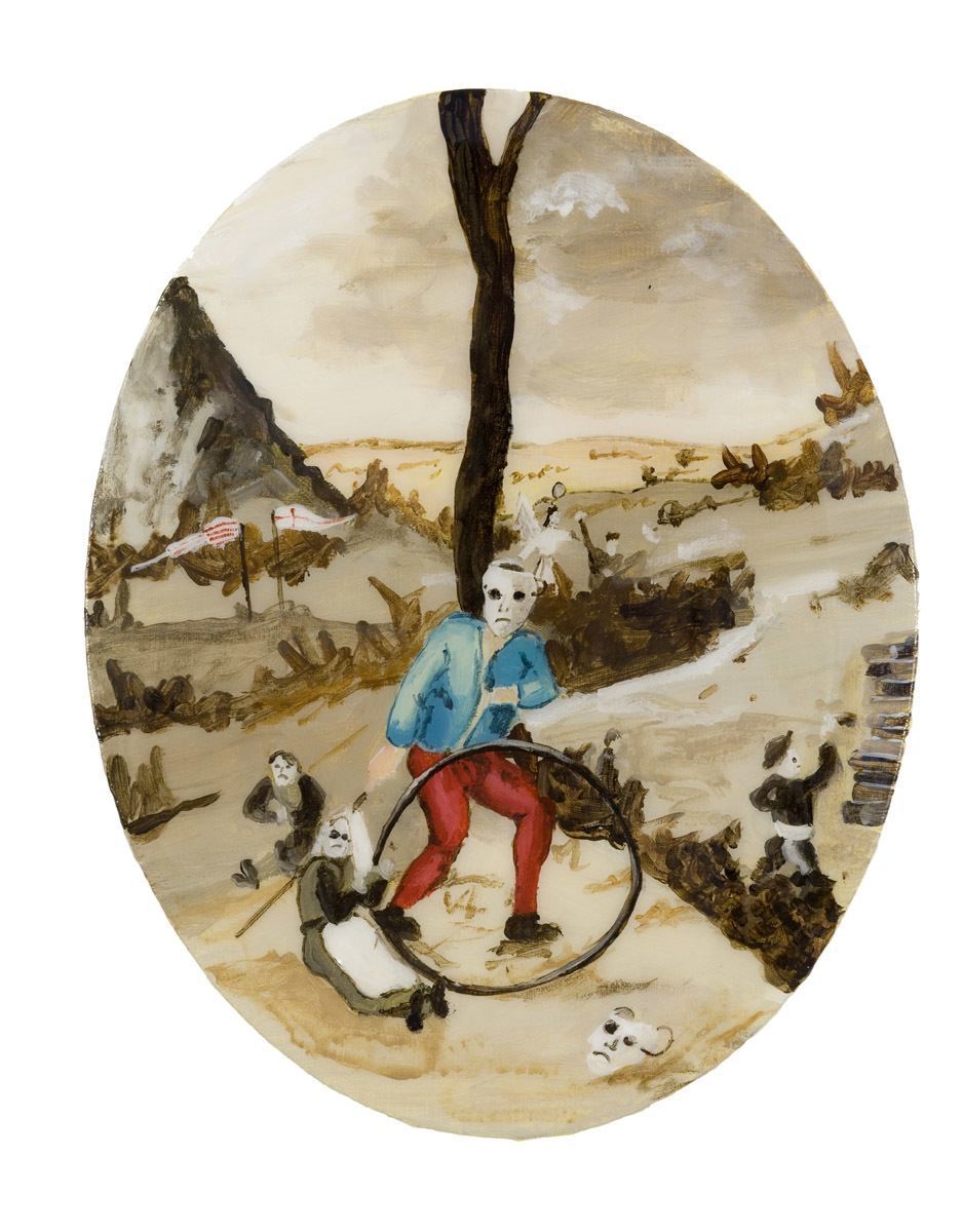
Henny Acloque:

I found several tondo’s on her website.

After Breugal, The Wheel, 2010, Acrylic and resin on canvas, 8 x 10 in. / 20.3 x 25.4 cm

I found several oval paintings on her website so she this is potentially more significant as it suggests she is making more than an occasional choice to use this shape.

However, an oval is fundamentally different from a circle (just as a square is very different from a rectangle)… an oval is not equal, like a circle, it’s like a rectangle with rounded corners. Geometrically it’s very different. It’s also the shape if you turn a circle away from you halfway before it becomes a vertical line.

I don’t know Breugal well enough to know the  particular painting that is being referenced, or even what part of his style or oeuvre.

Certainly in painterly terms this not even an oil sketch to his finished paintings, more a parody or cartoony sketch, though it is surreal in a similar way with a dove flying out of the protagonists head. But I can’t feel any of the religious meaning… it reminds me of an irreverent schoolboy sketch of the Mona Lisa… without any grace, beauty or power. It’s Breugal because of the surreal imagery and old fashioned clothes, but is not captured any of his soul.

Once again, I think you’d need to be rich and artistically educated to appreciate or pay money for this. So, even though her stated aim is to describe her own inner life and emotional responses, if these are opaque to the viewer then it’s private art.

In terms of the tondo I can see more of a point, like Mark Fairnington she features a circle which references the curved surface. And the vertical tree and red legs roughly split the canvas into three like a tryptich, which is interesting.

It would be very different if it had straight sides which were parallel to the central tree so I think there’s something here in the geometry of straight lines and curves, and using the tondo as part of your composition… but nothing fundamental in terms of enhancing meaning.

Mindy Lee:


Medusa’s Overfaced (Caravaggio) | Acrylic on paper plate | 24 cm diameter

medusa-carravagio.jpg

Fun, but fine art rather than painting… or maybe sculpture. And I don’t know how meaningful this would be if you didn’t know the original painting…. which although famous might still have limited recognition with the general public.

It reminds me of a lot of work I’ve seen in third year Graduation shows.

She chose to do a whole series of work on plates, which are round, but then she uses this roundness as a plinth rather than as a flat painting surface. And plenty of busts have a round plinth, so I’m not sure how relevant it is to painting.

Personally I like it in a fun sort of way but it doesn’t go very deep and I’m not sure it has any meaning. I think I’d soon get tired of it so would resent paying money… but it would be great in a museum and to stimulate debate.

She uses it for its sculptural framing (most busts are on a round plinth) and because of a plate’s association with food. But I don’t think it helps me find what it is about a tondo’s that would suggest themselves for a  painting… I may have to find out for myself.

Virginia Verran:

I can see the internal cohesion in Verran’s drawings (they are drawings rather than paintings both by medium and line). It feels like they are designed and constructed within the todo, rather than the tondo being an almost arbitrary canvas choice –  these are not rectangular drawings in a circular home… these are circular drawings.

Most of her work is fantasy scenes but her tondo’s are abstract, which is interesting.

‘Bioshereblues (2), pens and graphite ion mdf, 2013

(I’m assuming mdf as circular canvases are expensive? And drawings don’t sell for much?)

1302.jpg

Not fantasy (in the text book it says she uses delicate lines to depict fantasy scenes), but she’s got life and dynamism into her drawing, maybe even narrative, by likening it to a living cell.

What is it about this that makes it look like it was drawn for the tondo?

I think it’s the sense that the drawing evolved inside the tondo with the tondo an essential part of its evolution and meaning, whereas all the others look like they were ‘put’ inside a tondo.

Other contemporary tondo painters:

I did an experiment in my sketch book, as I suspected that tondo’s might work for an all over abstract painting. I used monochrome as I liked the monochrome paintings of Yan Pei-Ming and tried to make two all over paintings without reference to the shape, so I could see if the shape affected the outcome.

I don’t think the tondo was any better or worse than the rectangular painting, though it definitely gave the painting a different feel. I think the tondo adds a slight USP as it’s more unusual.

Next I Googled ‘modern tondo painting’ and the search page exploded with results. I wouldn’t classify any of these as art as there’s no meaning, but they would look nice in your living room. Generally they are big, and on my unrepresentative sample a surprising amount were by entertainers , self taught painters, or people with limited artistic training. The going price was about £800 upwards.

Of course the ultimate in decorative tondo paintings are Damien Hurts’s spin paintings, which with his brand stamp (even today when he’s fallen from grace) probably still cost considerably more than £800?!DHS4823_c_771_0.jpg

In conclusion:

I can’t find any modern commercially successful artists who use the tondo as part of their meaning system, though there are plenty of successful decorative artists who use tondos.

There are a range of critically acclaimed artists who’ve used tondo’s occasionally and won prestigious art prizes for their rectangular paintings, but I couldn’t find any major prize winners for tondo paintings.

Which leaves me with a problem… how do I best use the tondo for this exercise?

There’s obviously a link between shape (boundaries are important) and meaning but no serious critically acclaimed contemporary painter has had major success with tondos, or used the form regularly, so it suggests there is a problem. However, tondos are common in decorative paintings which suggests there’s a stronger link with pattern than meaning?

A circle is a different emotional space to a rectangle so I think I will try and compose my paintings ‘inside’ the tondo. Like the brushes, medium and surface I’ll try and think of the tondo as an artistic choice, though as it’s dictated it’s not a free choice.

Using a tondo will further distance me from the painting as a window, which is good, and force me to consider my flat space in a sculptural way, whereas before I’d just taken it as a given.

I may find new possibilities, but like travelling I will certainly come back to the rectangle with new eyes.

Another way of thinking of it is being on a round stage rather than a proscenium arch… I know all paintings are ‘theatre in the round’ in that the audience (viewer) can see the whole stage at once… but acting in a circle would affect your performance. Maybe that’s what I mean by being open to the space I’m working in?

Look at artists who have focused on aspects of the domestic interior.

Charlie Day:

On his Artist’s Facebook Page (he runs a gallery, Studio One Gallery, with his wife… isn’t that a bit like actor’s running a cooperative agency?)… anyway, at the moment the gallery doesn’t have a home so he must be selling his paintings elsewhere such a Saatchi Gallery Online. On his Saatchi online CV he includes a solo show at his own gallery (but doesn’t say it’s his gallery) which is a bit naughty.

He paints coastal semi-abstract landscapes culled from dog walking memories, but for my purposes I’m concentrating on his domestic interiors. Some are still lifes which remind me of my ‘Drawing 1’ and ‘Practice of Painting’ OCA courses. My memory is that though interiors can be still lifes, any arrangement items on a shelf could be said to be a still life, the artistic DNA is different. Still lifes are aesthetically based (so are nearer to abstracts) while interiors which are meaning based.

Charlie Day says his work includes, ‘… quick descriptions of representational objects in acrylic and charcoal, born of his experiments with the genre of ‘Bad painting.’

He currently works, ‘… mainly on what he calls ‘found cardboard’ culled from old ring binders which, because they are made of mixed materials, cannot be recycled. He takes these cast-off objects, which would otherwise be sent to landfill, and turns them into new artworks.’ It’s great to recycle but one can’t help being a little cynical and think that it’s more to do with it being a cheap material as I doubt you can make a living selling paintings on cardboard, and his painting on Saatchi are all on canvas.

So Lonely Here Without You Painting by Charlie Day

Sink.jpg

I like this, it looks like the taps are friends and one is turning into the other… it makes me smile. It’s an interior not a still life because it’s a ‘natural’ part of the room with ‘found’ objects in their natural state… in this case the sink. And tells us something about the owner, in this case we can make up myriad stories. The one Charlie gives is that this is the sink of a famous painter who bought one of his first paintings.

I also like the rough impasto as the sculpted paint that has a warmth and humanity to it. It feels almost alive and I feel like I know this sink.

It’s faux naive and does the job perfectly.

Not to copy this his style but I could definitely use the idea of quick bold descriptive, almost sculptural, painting with thick paint.  It comes from the heart… is not academic… and is almost like action painting where the energy and process of painting that is caught in the brushstrokes is almost as important as the finished piece.

Interesting to note his CV:
2016 MA Fine Art (Dist.), University of Brighton
2008 BA (Hons.) Fine Art (First Class), Central St Martins School of Art, London

Academically he was a high flyer as these are both top institutions, yet he paints in a loose, naive, almost expressionistic style

Jacquie Utley:

Here is her artists’s statement:

I work between the mediums of drawing and painting. I work in ongoing series often alongside each other, the still life paintings examine everyday objects and ornaments that sit side by side on shelves and ledges or in cabinets. The notes and drawings are the starting point for the paintings it then becomes the constant shifts that happen on the surface of the canvas between image and paint that becomes the area of investigation. A recent series of small scale paintings examine interior spaces and suggested narratives.

She calls them still lifes but because her subjects are ornaments sitting in their natural position, and she is wrapping narrative around them, I would say she is talking about interiors.

By allowing for the slippage between image and paint chance plays a big part in her painting, and in working in series she gets to know her subject very well. So, it’s almost like a series of dances ,or conversations, on the canvas. A structured improvisation where she leads the painting and then the painting leads her; like a visual meditation or of the objects and their possible meanings.

This is a very appealing way of working as I enjoyed working in series on my monotypes (maybe I could introduce an element of printing into my series?) and loved the way chance can make suggestions which push you further.

Jacqueline Utley, Flower Vase Sings, 2012, Oil on canvas, 12 x 18 cm (4.72 x 7.09 in)

Screenshot 2019-07-25 at 22.41.33.png

Very interesting, this is rough painted but in a very different way to Charlie Day. It’s not impassioned, and emotional… not homely… not accessible… the objects are barely readable… the physical record of the process doesn’t matter… the paint is placed on the canvas rather than sculpted… it’s much more high art. I don’t ‘get it’ but obviously people do and she sells for good prices at auction.

This would have to go in my elite box as I think you need a high level of artistic training to understand it. Unlike the Charlie Day’s painting whom anybody could read and appreciate. Yet in common with Charlie it has a faint whiff of naive painting, however in Jacquie’s case she shares something of a young child’s first attempts at figurative painting, rather than an untrained Saturday painter.

It’s reflective  and  looks and feels more like a still life than an interior, but as it’s in the OCA textbook they must classify it as an interior, so the classification is quite wide.

I like the way of working but don’t like the result as I can’t connect with it, but I’ll try working in series and not worry about ‘getting it right’. I also think I need to re-asses my criteria as to what makes a good painting, so I don’t limit myself, as some paintings I would dismiss as failures are critically acclaimed.

My main take is to be brave and work outside my comfort zone and produce images that I might not judge as successful. I could try ‘placing’ the impasto paint instead of moving it sensuously… and I might just capture something meaningful that I’d otherwise have missed.

Annabel Dover:

To read the runes of her practice she’s a storyteller, whether that’s painting objects (nick-nacks) around her house and grouping them together or canvases with subtle ‘story imprints’, like ghostly memories, in loose thin paint. It reminds me of those TV dramas (usually horror or detective) where somebody can hold an object and ‘see’ its memories.

Sometimes she writes down the stories and sometimes she leaves it to the viewers imagination.

It’s almost as if the objects are lightening rods for the world they were part of, or magic totemic objects carrying hidden stories of lost peoples.

She works in many mediums with much of her work being sculptural, and often groups her work, and creates meaning, by putting them together in collections. Sometimes her collections are exhibited in site specific settings (such as a wood rather than a gallery) where she makes the environment gift her art added meaning.

It’s difficult to find any ‘typical’ examples of her work or any paintings that feature a domestic interior.

head.jpg

I chose this because it is a domestic object and the thin tonality suggests a face and a story.

Annabel Dover, 2006, Bungalow One Tree, oil on board, 15x18cm.

Bungalow_one_tree.jpg

Again thin paint, but this time bold colours.

What I take from her work for my practice is the use of suggestivity for creating story, and how story can enchant the simplest of objects. So for my interiors I could try and make the real subject of my painting the imagined story of the objects rather than the object itself.


Assignment 3 feedback: Suggested viewing

Yan Pei-Ming – looking at monochrome and impasto technique.

Help…

YPM_1003__medium.jpg

The viewer reads in the context and is deeply moved to help… where… what… how… who… but also on the deeper ideas of charity, foreign aid… how we are numbed to TV appeals and conflict in distant countries.

Yan Pei-Ming: b. 1960 (Shanghai – Chinese)…

He was refused entry into Shanghai art college so enrolled in the École des Beaux-Arts in 1980, graduating in 1999. Therefore must have had money? Well off family? And took nearly 20 years to graduate so a part time degree while working?

From 1985, so before he graduated, he had several international group exhibitions, with his first solo exhibition in the United States  at David Zwirner in New York City, May 2007. Which I take as a stamp of international commercial success.

His trademark style is that he paints rapidly with big brushes on giant canvases in black and white or red and white – his most famous for paintings are of Chairman Mao.

Although he is best known for his is portraits of famous figures of the 20th century he spends a lot of thought on the emotional and psychological context of these paintings in his exhibitions and they take on a different meaning because of how they are displayed. He works hard on how these paintings relate to the modern world, to each other… and to the nature of power; though he says the ultimate power is in the paintings themselves.  So although his thick paint feels feral and his images visceral they are always framed by meaning as he refers back to famous paintings, relates them to other paintings in his exhibition, and to modern politics.

This is a video of his 2015 Salzburg exhibition: https://www.youtube.com/watch?v=synI5e1Y8II where he explains a little of his thinking.

And here he talks about his work in series… https://www.arte.tv/en/videos/050046-012-A/atelier-a-yan-pei-ming/

He says he is interested in ambiguities and emotion; wants the viewer to enter his paintings through imaginary (and slightly sinister) landscapes; and to feel the physicality of the paint. Which makes his work a really interesting mix between figurative, sculptural, emotional and ideas based painting.

His backgrounds are suggestive and intriguing – and while his figures are more real than real with personality popping out of their eyeballs, their features often emerge out of  a melange of intrigue.

He uses black and white because he finds colour interrupts the image, and makes the paintings more powerful. I agree and think his black and white paintings are nakedly honest and emotionally powerful.

Black Selfportrait
2007
Oil on canvas
Image Size: 137.8 x 137.8 inches 350 x 350 cm

0000015676.jpg

As a postscript he seems to use famous photographs and paintings as source images, which already bring heaps of meaning and status to his paintings. Today a lot of marketing is about visibility and these paintings do half his job for him as they are instantly recognisable. Even an unknown artist painting a famous person will get more interest than if they were painting somebody unknown. His ‘famous people’ paintings are by no means fan art and he does repaint rather than copy, but I think they are much weaker than his self portraits and verge on the cynical.

And in some paintings he lets his paint run which makes you aware of the painter and the vertical flat surface… for some painters I think this works really well but I think he’s much stronger in his sculptural work where the 3D paint catches the light and transforms flat images into living worlds.

What I think works really well and I can use in my practice is the indistinct and suggestive mark making which works so much better than spelling it out. And the power of monochrome.

Here’s a visual response in my sketchbook.

Final Assembly, ink on A3 drawing paper

IMG_20190718_212329.jpg

It may be simplistic and was better when it was subtler but it captures something of the moment where a mum was looking at her child from the kitchen window before she had to turn away and get back to work.

This is a new way forward for me, painting from memory in a fluid way while trying to capture a significant emotional moment, and feels good.

I like his impasto work but am not working in impasto yet… it’s something I can store away and try out later. As is two colour painting – black and white, where unlike ink you can correct mistakes (once you’ve covered up the white paper you can’t turn it back into a highlight) but you can paint on highlights with your white paint.

Glenn Brown – for distortion and a play with media.

b. 1966 – British

The Hinterland, 2006, Oil on panel, 148 x 122.5cm

3de57799766ee5fb1c83bfd0a9d228692c8f50f0.jpg

This is useful because I very quickly found his work derivative, boring and utterly pointless…. decoration passed passing itself off as art.

But, jaw droppingly skilful.

As I was walking the other day I saw a home decorator and this got me musing about the skill of traditional plasterers. Plastering is not a DIY job. I had an artist friend who supported his early career by working as an occasional plasterer (he ended up as the youngest ever head of Dublin art school) and another who had a five year apprenticeship as a carpenter, who could do anything with wood.

Painting as trompe l’oeil, it struck me, is a craft skill, which is why many classical painters started as apprentices. Making a flat surface look like a window is nio different in essence than a master craftsman making a chair. But neither, I would argue, are art: at least in the sense that they don’t deal in the world of ideas, emotions or concepts. One is functional in that it captures a likeness and the other provides you with somewhere to sit.

So painting, per sé, is not art. But painting can be art… it’s the added value, where the subject is the vehicle for something else that makes a painting into art rather than a window or human camera.

Coincidentally, the real economic value and status has always been in art rather than painting… the great masters were so much more than masters of ‘window’ painting, they used their skill and subject matter as a vehicle to examine the world.

So I learned something very important… that I don’t want to be a painter as window, or a painter as thief using other people’s work. And although skill is very important, of itself it’s not the end point because here is somebody who is blissfully skilful (and no doubt commercially very successful) but who’s work has no passion, no connection and no ideas… it’s pure cleverness.

Interestingly, having had a strong gut reaction to his work I then researched him and found he is known for the use of other people’s work, and has been accused of plagiarism.  He takes famous paintings or photographs and digitally manipulates them before meticulously painting the results to create a flat, almost digital ,surface.

I’ve also learned I like movement and texture in my work.

The Day The World Turned Auerbach 1991, Oil on canvas, 56 x 50 cmglenn brown the day the world turned auerbach.jpg

This looks more like a forgery more than an appropriation.

Daydream Nation (2017)

BROWN-2017-Daydream-Nation_Gagosian-742x1024.jpg

This looks as though a painting has been put through a computer programme to change the skin to wallpaper. For me it has no soul, even with added cloudy eyes.

Edvard Munch – related to German expressionism.

b. 1863 – d. 1944, Norweigan

As I know a little of Munch I didn’t want to be biased so decided to research him first before looking at his paintings.

My research gave me a tingle as I could see so much of me in him, though I never had his bohemian lifestyle, heavy drinking, mental instability or fear of insanity.

Melancholy 1891

Edvard_Munch_-_Melancholy_(1894).jpg

I get this, it’s meaningful to me, without words.

Munch spent a lot of time on the edge of penury and was supported by his dad. As an actor only ever having signed one non acting contract (for three months) in over 40 years I know what not having a good stable income feels like. He also came from a religious household… and my dad was a vicar, who died when I was 13, but my mum was very religious and my brothers both became religious leaders.

When he went off to art school Munch was influenced by Hans Jæger, a leading bohemian, who pushed him to paint his own emotional and psychological state. I missed the bohemian bit but am very interested in capturing emotions.

Paul Gauguin, Vincent van Gogh and Henri de Toulouse-Lautrec were big influences in Paris and they are all artists I love, and who’s colour work I find moving.

Wikipedia says… He wrote his goal in his diary: “in my art I attempt to explain life and its meaning to myself.” This is at least part of the reason why I paint, to capture meaning (cage it) on canvas so I can examine it.

His friend Christian Krohg said:

He paints, or rather regards, things in a way that is different from that of other artists. He sees only the essential, and that, naturally, is all he paints. For this reason Munch’s pictures are as a rule “not complete”, as people are so delighted to discover for themselves. Oh, yes, they are complete. His complete handiwork. Art is complete once the artist has really said everything that was on his mind, and this is precisely the advantage Munch has over painters of the other generation, that he really knows how to show us what he has felt, and what has gripped him, and to this he subordinates everything else.

Beautifully put.

Munch was inspired by Gauguin’s work and philosophy, and I love Gaugin’s work too;  his colours, his print like quality and blocky composition. And Gaugin reacted against realism, which I do, and said that “art was human work and not an imitation of Nature”.

I’ve just experimented with prints and found them captivating and Munch really liked printmaking and woodcuts too.

He formulated the Synthetist aesthetic, and The Talisman, by Paul Sérusier, a principal works of the Synthetist school (below) was my favourite painting for many years.

1200px-Serusier_-_the_talisman.JPG

Munch’s mature style includes a simplification of detail, shallow pictorial space, minimal background to his up front figures, and an almost static theatrical pose that signified emotional states which are all elements I connect with. He wanted his people living and on fire, but they were symbolic rather than real people.

Ashes, 1894

NG.M.00809_2_pressebilde.jpg

For some reason this has the same feel as Peter Doig’s work which I also love… magical realism?

20091127030335_peterdoigwhitecanoe.jpg

My take for my practice is that I (when I get the technical skill) I can make stuff up and paint imaginary people and landscapes filled with my imagination. There are other things I want to do, but that’s definitely one of them.

I’d like to create worlds that I and my viewer can get lost in and where I can (metaphorically) dance on the canvas… in the moment and fully connected. Like when a director says action, if it’s really working, I don’t know what’s happened till he says cut… I’ve been in a different reality.

Leon Kossoff – use of impasto.

b. 1926 – d. 1919, UK, London

I’m starting with a blank canvas as I only vaguely know Kossoff’s work. A quick search threw up that he was mates with Frank Auerbach (who had a similar impasto technique and local London subject matter). And they both studied under David Bomberg who birthed a lot of similar artists, so was obviously a very influential teacher.

His other artist friends included Francis Bacon, Lucian Freud and Keith Critchlow; so he was a child of his time and I might expect similar concerns.

Children’s Swimming Pool, Autumn Afternoon, 1971

T03246_10.jpg

This is very different from Frank Auerbach, as though the paint is impasto it is brushed much less fractured and figurative.

I have seen this in the flesh and it’s much darker, so I don’t know if this has been photoshopped or he did several versions.

Reading on the Tate website about his working methods is revelatory. He scraped off the paint and repainted continually over several weeks. This feels like the equivalent of correcting my lines in life drawing… or making multiple oil sketches for a finished piece. In effect he is working in series like I did for my last assignment, being open to chance (seeing what works and doesn’t work) and really understanding his space – the canvas – and how his painting works inside it.

After this process, when he was ready, he painted the final image in a few hours.

What this meant was that he combined process with freshness, looseness and spontaneity to produce seemingly effortless and stunning paintings.

This is a good pointer for me and reinforces what I learned with my last assignment, the value of working in series and evolving a painting over time till you really understand it. Then being able to spontaneously capture it in one creative splurge.

I think this is a working method that would really suit me.

At t he moment, to work on scale, and sacrifice so much oil paint at £5 a tiny tube, is too expensive… but there will be ways I can come close. Maybe work small… do one big mock up… then paint the final canvas?

Booking Hall, Kilburn Underground,1987

T05531_10.jpg

The Tate goes further into his working methods and explains how he took direct sketches from site (charcoal) and pinned these round his studio. I painted my Mother-in-Law’s Tongue solely from sketches – no photographs and no access to the real plant while painting.

Mother in Law tongue.jpgThough I launched straight into the final piece and it’s tight it still has a quality missing (as my relationship was with creating an image from inside me not copying a photograph from outside me) from all my other work from Practice of Painting. It’s like the plant has a soul, and I really like it.

So, working from on site sketches is definitely something I would like to do. My life drawing is helping me with figures… I just need to get a bit braver in public spaces.

With Kossoff the physical and visual sensation is more important than representational accuracy, and that’s how I want to paint too.

Self-Portrait, c.1952

T07198_10.jpg

This is particularly interesting as he painted this while a student and was first being influenced by David Bomberg’s (he took extra classes) loose style, as different to the tight academic brushwork he was learning at Sty Martin’s Art School. And I’m a student too… so it gives me hope.

He painted wet on wet which is something I’ve tried and like, but was worried about the blurring of pictoral forms with my remnants of ‘this has got to look like what it is’. Here I can see how it works and that, though I can’t do it yet, it’s not something to be scared of. So, is another technique I can use in my practice.

Another technique which would be great to play with is that he painted straight from the tube and mixed on the canvas… I’d love to do that.

This unit has set me thinking about the tools (both surface and mark making) that I use to make a painting and it’s interesting how Kossoff used the brush handle to scrape the paint away on his neck, and use line on an expressionistic tonal painting. Something else for my toolbox.

The Tate comment on this painting is particularly useful. It says that this is not a likeness based painting, but an ‘intense evocation of a young man’s expression and emotion, devoid of any social contact or context.’ Which is what I was I did when I was painting back in to my prints, or at least that’s what I ended up with. Not me per sé (though if you know me you can see me in here) but a universal yet specific man.

At least, that’s what I liked about my final image.

IMG_2031

Finally, there’s a quote from Leon Kossoff that is very resonate for me now on this course as it echoes how I am feeling… just substitute Understanding painting Media for Bomberg.

In 1995 Kossoff said that ‘Although I had painted most of my life, it was through my contact with Bomberg that I felt I might actually function as a painter. Coming to Bomberg’s class was like coming home’ (quoted in Paul Moorhouse, Leon Kossoff, exhibition catalogue, Tate Gallery, London 1996, p.12).

Formative feedback for Part 3 (My response)

As it’s so useful I’m going to put suggested viewing as a separate post when I’ve finished this.

———————————————————————————————————————-

I was very pleased with this feedback as I made a huge effort to break away from my old ways and it was great to hear I was on the right lines.

It feels as if this is where my degree is starting, up to this point I was painting and thinking outside in… I was copying the outside of things in a tight way like a human camera. This, my final level one course, and specifically Part 3, was where I turned the corner to see that painting is putting the inside out.

Art is not about copying exteriors (thousands upon thousands of Sunday painters have the craft skill to paint pleasing landscapes and hundreds of trained painters copy other painters styles) but about releasing what’s inside the artist . A painting, is the ultimate signature, it carries the voice and soul of the artist and is full of meaning… … and that’s why even the most skilful copies are never like the original. An artist is not the equivalent of a tribute band, not a forgery, nor a copy made for money, though all of these have commercial value, but something new born of the artist herself.

The work of great artists is constantly changing because they are changing and that change transforms and informs their work.

Just like reading the same book at twenty and sixty would be a radically different experience because the reader (and society/culture/politics) has changed so too is the art as they change and grow.

My job as a student is to begin to find my own voice and to be ruthless in rejecting what doesn’t help and accepting what does.

……………………

The feedback

Overall comments:

I agree with everything Diana said namely that the unpredictability of printing released me to work in new ways which both pleased and surprised me.

I am now much more focussed on what the work is about rather than copying other artists’ styles and am using other artists to help me find alternative answers and new ideas rather than as templates to copy.

Exploring before going into my final piece and letting it evolve as my understanding developed, and being open chance, produced a much more successful Assignment than deciding before hand what my final piece was going to be and then trying to make it.

A huge discovery, and one I’m still struggling with, is that working spontaneously can produce better more honest results than spending hours on a realistic drawing. It’s hard wired that the more time I spend the better it is but I’ve just proved that isn’t true. I now need to emotionally accept it.

I think there is room for both (spontaneity and realistic drawing depending what the work demands).

Both semi-abstraction and suggestive painting are great ways to add intrigue and draw the viewer in, and to involve them in creating the meaning of the painting. I think the work of Frank Auerbach is both semi abstract and suggestive (and very subtle too).

For example Head of JYM No 1 is compelling in its semi-abstraction and suggestivity. Even though distorted this is the portrait of a real person and full of meaning, and is working on multiple levels from capturing the soul of a person to discussing the formality of painting in terms of abstract construction. It is full of painterly language as well as action and passion.70e4c0c8c587df024468454c2eb89287.jpg

I can see that different media and techniques will lend themselves to the concept of my work in the same way that a theatre play, villanelle, sonnet, TV series or feature film will lend themselves to different concepts in the literary world.

My big problem is that I am only just beginning to scratch the surface as to what is available, I guess in my terms it means using the best media and techniques I have at the moment.

I am realising that trying and testing instead of being an obstacle to what I’d planned, and to be avoided, are where my work finds life. And I’m beginning to become much more confident with both allowing time for experimentation but also limiting it in terms of time pressure. There’s always a danger of getting lost in development hell (a film term) where you are endlessly changing and developing a concept and never drive forward and make it.

Discovering water based oils which let me explore the sumptuous colour, texture and tone of oils while avoiding the smell has been a revelation.

I enjoyed both the subtlety of Elizabeth Peyton and strong impasto techniques (which sums up my character very well) and agree I should play with both.

Feedback on assignment:

Exercise 3.1 – 20 A4 ink studies of my face

I agree with everything Diana has said. Working quickly and in a totally new way – three tones – 1 minute each (whereas in the past I might have spent 8 to 10 hours on each drawing) – and harnessing spontaneity and subtle changes in tone and pressure has allowed me to capture something fresh and compelling. And shown me that looseness snd suggestivity are powerful tools.

I can’t ignore the evidence, I just have to accept it emotionally and put it into practice.

fullsizeoutput_be7

Exercise 3.2 – monoprint from one of the ink sketches in 3.1

This gave me room to focus more on features and expression but I agree with Diana that the tones are heavy handed.

However, I was surprised at how many natural expressions I created (which just seemed to appear of their own volition) and how even the strong tones started to add a 3D effect.

Making the tones more subtle in future is something I can work on.

fullsizeoutput_c68

Exercise 3.3 – subtraction

I was really interested to note Diana’s comment that subtraction was adding more intrigue (which explains why they were working better) as I found this exercise very difficult and thought the prints would be much weaker that the previous exercise. But in a strange way they were stronger, even though less lifelike, and I couldn’t work it out.

Good to know the proportion is working better and that you could see I had tried to use depth and shadow. I accept that the heavy tones look pasted on like make up or marks on the skin and that more subtle tones would give the prints a more moulded feel.

fullsizeoutput_c97

Exercise 3.4 painting back in

Three pieces and I can see what Diana says about the second and third piece… that they were derivative and too heavily based on somebody else’s style. There is a (not so subtle) difference between copying someone style and using part of it to inform and improve your own work. One is dishonest, the other honest.

A good point and the comment helped me to see clearly what I’d felt at the time but couldn’t articulate.

With the first piece I was honest to my own voice and used Elizabeth Peyton delicate technique and the colour palette of German Expressionism to enhance my own voice. It felt ‘clean’ and honest and is one of my pieces everybody likes.

IMG_2031.jpeg

It was nice of Diana to say she liked to see me working outside of the box and using alternative media. I agree I need to do more of that and anything I do to work away from the representational is good – but I think there’s plenty of scope to do that in an honest way which is true to my own style.

Assignment 3

A small pat on the back… I’ve been doing this course for 3 and a half years and this is the first time my tutor has said my final piece is successful. Imagine a small contented smile.

I’ve been working really hard to change my approach (it helped hugely in my last feedback when Diana spelt out that it was my fundamental approach that was wrong rather than just tightening up because it was an important piece). This is the first time I treated it as a process of experimentation rather than deciding what my piece would be before I started and then trying to recreate it on canvas. I can see now that’s an awful way of working which precludes growth and chance, and almost guarantees tightness.

I just have to make that my normal way of working.

It’s nice Diana picked up on my understanding of the variables such as pressure, thinners and applicants as this was a big part of my experimentation. I’m just beginning to realise what a big difference the ‘ingredients’ make… a bit like the difference between a chocolate cake and lemon drizzle cake… your raw materials and how you combine them is a massive part of your art. Just as a bakers choice of flour will affect the bread he ends up baking so too your materials and techniques affect your art… and different materials and techniques favour different concepts.

I’m glad the final prints match my concept of the different stages of Maradona’s life. It was like a three way collaboration with the material, my concepts and chance. I was always driven by what I wanted to say (my concept) not by how I was going to say it and  at no point did I have an end point in mind. But because I was so involved in the process and concept I knew when something was working.

And all the time I was looking and thinking about the film and Maradona so getting to know my source material better, which probably explains why the flesh tones were more accurate.

The format was a lucky chance – I tried out different formats and this leapt out at me as being a visual language and having the idea of a life ‘developing.

IMG_1984 2

Sketchbooks:

Delighted that I’m finally getting this right and they are creative and explorative, and are supporting my work.

I’d lost my way with sketchbooks and wasn’t motivated because I thought they were just for sketching, it’s not that I don’t value drawing skill per se but my drive is my thoughts and ideas not copying an external reality… in ‘drawing’ there wasn’t any input from inside me, it was a pure skill/craft base outside in exercise. But when Diana explained on my last feedback that they were a visual response to the world, like a visual log book. And I could do anything I liked in them it opened the floodgates and I now see them as part of my art practice.

I’ve just got to keep it up and timetable 30 minutes a day for my sketchbook.

Research:

Another point Diana raised in my last feedback was that my research was in depth but disconnected from my practice so I made a huge effort to relate all my research to my practice.

I am looking at artists I can use for different concepts.

The point being that my research is a resource bank of ideas that can inspire my practice, not to copy their style but take from it anything that will help my style.

This feels much better and I’m a lot happier… I do like research but it had begun to feel that it bore no relation to what I was doing, took acres of time, and was more like history of art research; whereas I’ve chosen to do a painting degree.

Now, just like my sketchbook, it feels like it is a part of my practice.

Learning Logs or Blogs:

Good to have the tip that I can be even more ruthless in identifying what is working and what isn’t.

I feel I have more to do on this, it’s a great chance to reflect on my working practice so I can figure out what my process is and find out what’s working and what’s not. And to tell the story of my concept, methodology and format to the examiner, but I can hone it down even more. There’s a tiny element of writing it because it’s fun (and with a readership in mind), but I think the Blog is a working tool and I need to be more ruthless.

The examiners will get it however honed down it is and I’m not writing a magazine article.

Being more ruthless will cut down the time I spend on it and also make what time I do spend more effective.

Critical essay:

We had quite a long chat talking about my first critical essay and this was very useful.

I bounced my ideas off Diana and she came back with questions, summaries, and corrected my misconceptions.

I really enjoyed this as I miss mixing with other students and artists who will engage with, and challenge, what I’m saying and thinking – I think that debate with your peers and tutors must be one of the treats of being at art school. And it’s a fantastic way to test out ideas, formulate new ones and find out what I really think.

My biggest misconception was that I had to include an old master like Rembrandt.

We came up with a plan which will help my practice and be exciting, whereas when I started I was thinking of this as a slightly daunting and disconnected academic exercise.

I’ve chosen oil paint as this is the medium I want to develop because of it lovely texture, deep hues and subtle tones… and how it stays workable… and you don’t get the tonal changes as it dries like you do with acrylic.

I will look at two artists 100 years apart… one from 1919 ish and one from now (ish) and consider the  social, cultural, artistic and political context and how that might be filtered through the individual artist. You can’t generalise from one artist so it will also be about their unique voice and use of oil paint married up with their concepts.

For me (when my painting works… and this is where I want to go) painting is a performance with the canvas as my fellow actors and audience. You are in the moment reacting to the colours and what they have to say and how the marks are working on the canvas. It’s all about listening. The process is the same as acting, you do mountains of research and then turn yourself off for the performance and let the character come to life.

When I step back and look at the canvas it’s like looking at a video of what’s happened… I become a viewer and not a creator. In acting terms it’s more like changing from actor to director.

So, one possible idea is to look at the performance and physicality of moving oils around on a canvas.

Quite how I’ll get all of that in 500 words I don’t know.

Strengths:

(1) Take your spontaneous and freer marks into future work – and combine with traditional techniques.

Yes, I agree… I am going to try and make this a much bigger part of how I work

(2) You delve into new ways of working and can see the benefits of how you can take them forward.

Yes, I love finding new ways of working, and each one opens up new possibilities I’d never have imagined… like monotype and printing.

(3) You work well with format, multiples and arrangements and this display can be as important as the finished piece.

Another revelation from this assignment which is so exciting.

As an actor I love playing with words both vocally and visually, they form a collective meaning – like a line in a poem – and the meaning is utterly different depending on order, emphasis and delivery.

So too with paintings… only you’re using a visual language which I’m only just beginning to understand.

(4) Your research is strong but now you are relating/applying them to your work and this is helping you work in alternative ways.

Yes, this is a turning point and feels much better.

Areas for development:

(1) Working suggestively shows more intrigue than spelling it out.

I have to fight a twitch to improve and clarify. But when I can work spontaneously and quickly and leave it it produces much stronger work.

So this is something to factor in to my practice and try and improve.

(2) You are being more inventive and creative with you processes and the assignment piece shows this.

I would like to make this my new way of working and am a bit embarrassed how I’ve worked for three and a half years.

Early on with the OCA I read a quote from Picasso about one piece just being a practice for the next, and never having finished… so his life’s work was one of continuous artistic evolution or process. I like this image and can apply it to my paintings, where the ‘finished’ painting is the result of the process (or evolution) which led up it.

(3) Working with mixed media and alternative surfaces gives more dynamism to your work.

I tried a different surface for my monotypes and this was very successful.

This is something I need to work on… trying different media together and perhaps more importantly trying different surfaces.

I think I’ve been held back by thinking I’m painting something to sell that has to be durable, eventually that may be the case, but at the moment I’m a student and this is the time to explore and experiment, so I’ll try and use different surfaces in Part 4.

(4) Time to start writing a draft of your essay. Make sure you are connecting your practice to the research as you write it.

Yes, I agree, the key to this degree is relating everything to my practice. Creating art excites me… painting pretty landscapes doesn’t, it’s mechanical and boring.

I’d become a bit lost by the end of Practice of Painting. I was bored with tight representational painting and the research and sketchbooks didn’t seem to have anything to do with where I wanted to go.

Now, I’m discovering my voice, the chains are off and suddenly it’s like turning on a light. And connecting my research to my practice gives it meaning and will drive me forward.